The company
The company
The company
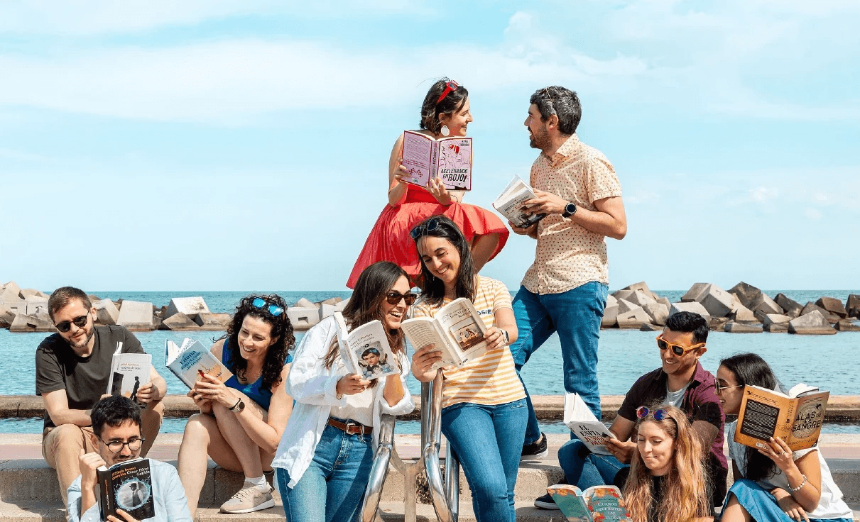
Planeta de Libros
Planeta de Libros is one of the largest Spanish-language publishing platforms, with a catalog of thousands of books, dozens of imprints, and strong digital presence across more than 10 countries.
0K
0K
Books available online
Thousands of titles across genres, authors, and publishing imprints.
0K
0K
Books available online
Thousands of titles across genres, authors, and publishing imprints.
0K
0K
Books available online
Thousands of titles across genres, authors, and publishing imprints.
+0%
+0%
Traffic from mobile devices
The majority of users discover and explore books on their phones.
+0%
+0%
Traffic from mobile devices
The majority of users discover and explore books on their phones.
+0%
+0%
Traffic from mobile devices
The majority of users discover and explore books on their phones.
+0
+0
Active countries
Planeta de Libros reaches audiences across Latin America and Europe.
+0
+0
Active countries
Planeta de Libros reaches audiences across Latin America and Europe.
+0
+0
Active countries
Planeta de Libros reaches audiences across Latin America and Europe.
+0M
+0M
Monthly visits
A steady and growing user base browsing books and collections every month.
+0M
+0M
Monthly visits
A steady and growing user base browsing books and collections every month.
+0M
+0M
Monthly visits
A steady and growing user base browsing books and collections every month.
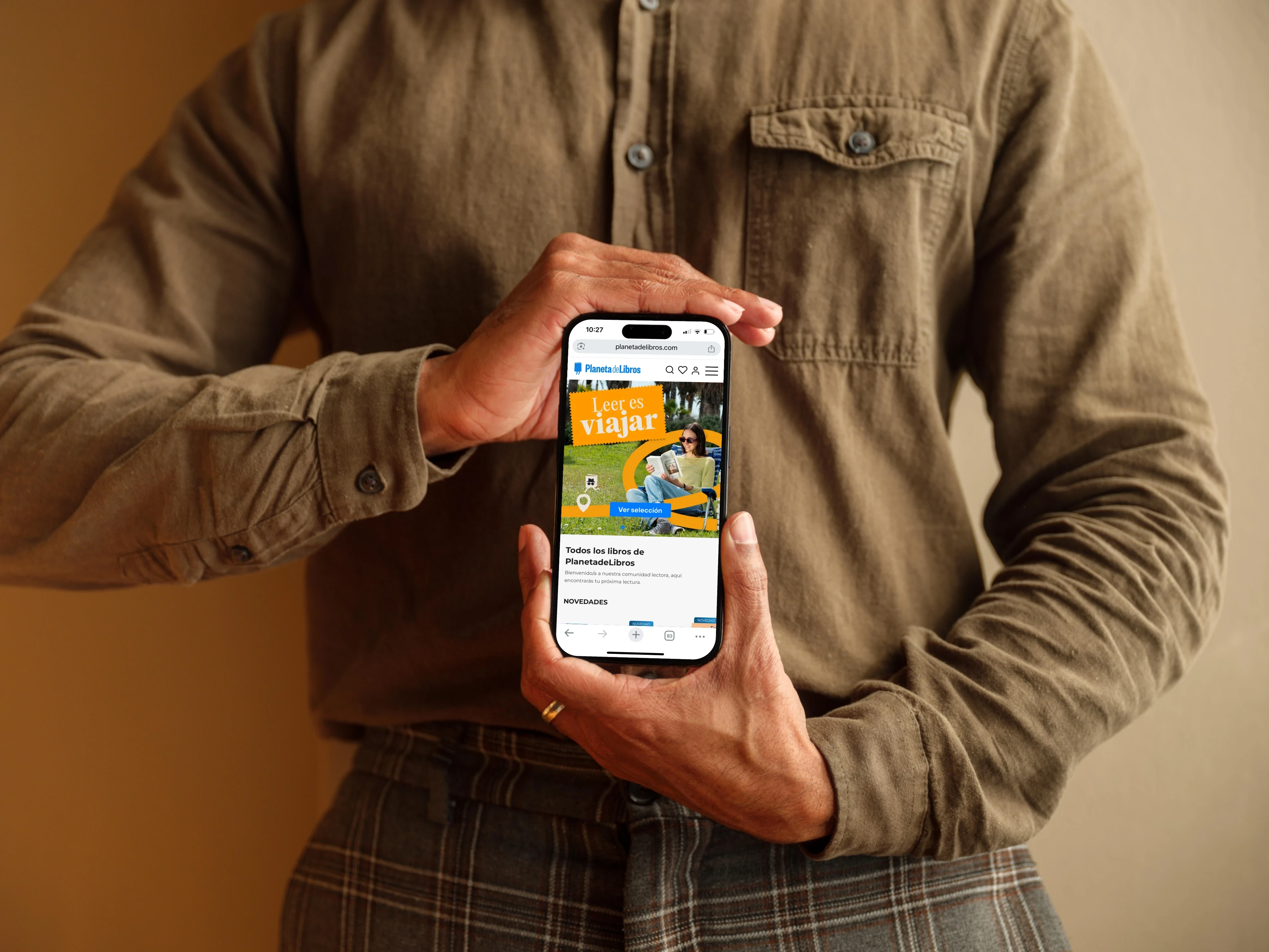
Simplified browsing and navigation
We redesigned the homepage to guide users more intuitively through the catalog. Carousels and categories are now easier to explore with touch gestures. Users can move between sections quickly without feeling lost or overwhelmed.
Clean homepage layout with visual carousels
Tap-friendly spacing and clear touch targets
Easy access to categories and collections
Separated card layout improves legibility
We simplified the reading and comparison between flights
We reorganized key information (schedule, duration, and price) into clear visual cards. Each option is perceived as a complete, comparable unit, reducing scan time and the need to scroll.
Origin, destination, and flight type
Visible carrier – Iberia / Vueling / connection
Price highlighted on the right, easy to select
Separated card layout improves legibility
Optimized book detail pages
Key information like title, author, and price is now visible immediately upon entry. Primary actions are fixed in place so users can act at any moment. The layout supports fast scanning and encourages exploration of related content.
Title, author, and price visible without scrolling
Persistent "Buy" and "Read a sample" actions
Clear hierarchy for synopsis and metadata
Quick links to genres and editorial imprints
Additional flight details
We added a side panel that displays additional flight details (such as terminal and total duration) without forcing the user to leave the screen or load new views.
Total flight duration visible at the start
Easy-to-follow vertical organization
Complete segment information (schedule, terminal, duration)
Clearly indicated connection time
Destination image adds visual context
A more visual, mobile-first experience
We brought covers to the forefront, making the interface feel more alive and editorial. Typography and spacing were adjusted to improve readability on small screens. The overall design feels lighter, more responsive, and true to the platform’s identity.
Emphasis on book cover visuals throughout the journey
Improved legibility with mobile-optimized typography
Lightweight, fast-loading components
Unified and consistent editorial design language
We simplified the reading and comparison between flights
We reorganized key information (schedule, duration, and price) into clear visual cards. Each option is perceived as a complete, comparable unit, reducing scan time and the need to scroll.
Origin, destination, and flight type
Visible carrier – Iberia / Vueling / connection
Price highlighted on the right, easy to select
Separated card layout improves legibility
Solution
The structure remains; the experience is transformed.
A clearer, more scannable, and efficient screen
Solution
The structure remains; the experience is transformed.
A clearer, more scannable, and efficient screen
Context
Context
Context
What was the challenge?
While editorial content was rich, the mobile experience wasn’t aligned with current user behavior.
Analytics revealed a high bounce rate from mobile users and low interaction with book pages.
The book detail layout was dense, text-heavy, and didn’t encourage exploration or action.
Objective
Redesign the mobile web experience to improve usability, highlight key editorial content, and make book discovery easier and more engaging.
Solution
Solution
Redesigning the mobile experience to support book discovery
Now discovering the next book feels as natural as flipping a page.
Simplified browsing and navigation
We redesigned the homepage to guide users more intuitively through the catalog. Carousels and categories are now easier to explore with touch gestures. Users can move between sections quickly without feeling lost or overwhelmed.
Clean homepage layout with visual carousels
Tap-friendly spacing and clear touch targets
Easy access to categories and collections
Separated card layout improves legibility
Simplified browsing and navigation
We redesigned the homepage to guide users more intuitively through the catalog. Carousels and categories are now easier to explore with touch gestures. Users can move between sections quickly without feeling lost or overwhelmed.
Clean homepage layout with visual carousels
Tap-friendly spacing and clear touch targets
Easy access to categories and collections
Reduced friction in first scroll experience
Optimized book detail pages
Key information like title, author, and price is now visible immediately upon entry. Primary actions are fixed in place so users can act at any moment. The layout supports fast scanning and encourages exploration of related content.
Title, author, and price visible without scrolling
Persistent "Buy" and "Read a sample" actions
Clear hierarchy for synopsis and metadata
Quick links to genres and editorial imprints
A more visual, mobile-first experience
We brought covers to the forefront, making the interface feel more alive and editorial. Typography and spacing were adjusted to improve readability on small screens. The overall design feels lighter, more responsive, and true to the platform’s identity.
Emphasis on book cover visuals throughout the journey
Improved legibility with mobile-optimized typography
Lightweight, fast-loading components
Unified and consistent editorial design language
Results
Results
Results
How it worked?
By focusing on clarity and touch-friendly design, we reduced friction and encouraged deeper exploration.
+0%
+0%
Books explored per user
Users browsed more titles per session, showing improved engagement with content.
+0%
+0%
Books explored per user
Users browsed more titles per session, showing improved engagement with content.
+0%
+0%
Books explored per user
Users browsed more titles per session, showing improved engagement with content.
-0%
-0%
Bounce rate on homepage
Fewer users dropped off after landing, indicating a smoother first-touch experience.
-0%
-0%
Bounce rate on homepage
Fewer users dropped off after landing, indicating a smoother first-touch experience.
-0%
-0%
Bounce rate on homepage
Fewer users dropped off after landing, indicating a smoother first-touch experience.
+0%
+0%
More users reached actionable CTAs
A greater share of users interacted with "Buy" and "Read a sample" buttons, showing increased purchase intent.
+0%
+0%
More users reached actionable CTAs
A greater share of users interacted with "Buy" and "Read a sample" buttons, showing increased purchase intent.
+0%
+0%
More users reached actionable CTAs
A greater share of users interacted with "Buy" and "Read a sample" buttons, showing increased purchase intent.
Contact
Contact
Contact
Get in touch
Interested in collaborating or sharing your vision? Reach out using the contact info below.
annapenya.design@gmail.com
Telephone
+34 622 90 77 06