
Back
Desktop
Travel Industry
Flight Availability Redesign
Redesign of the flight availability step in Vueling’s app to simplify comparison between options, improve fare clarity and reduce friction in a key part of the conversion funnel.
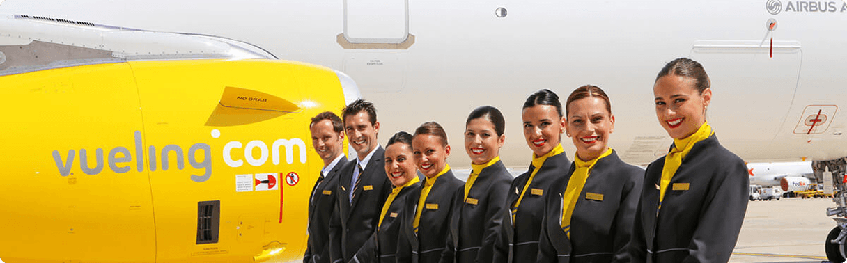
Vueling
Vueling is one of the leading low-cost airlines in Europe, based in Barcelona and part of the IAG group. It operates more than 140 destinations across Europe, North Africa, and the Middle East.

What was the challenge?
In the flight selection step, users were taking over 95 seconds on average to make a decision. Additionally, 30% scrolled through the entire page before selecting an option. These signals indicated difficulties in comparing similar flights and understanding fare differences. The existing solutions lacked hierarchy and required too much visual effort.
Objective
Reduce decision time and increase efficiency in flight comparison by improving fare comprehension and facilitating progression to the next step in the booking funnel.
How it worked?
The new desktop design not only improved visual clarity but also had a direct impact on user behavior and conversion funnel performance.
Get in touch
Interested in collaborating or sharing your vision? Reach out using the contact info below.
annapenya.design@gmail.com
Telephone
+34 622 90 77 06